Behind the CA Brand
in 2026, we rebranded to uphold the ethos of our very name. To embody Constant Advancement, our visual identity must mirror the quality and forward thinking of our work. Here is a peak into the process.

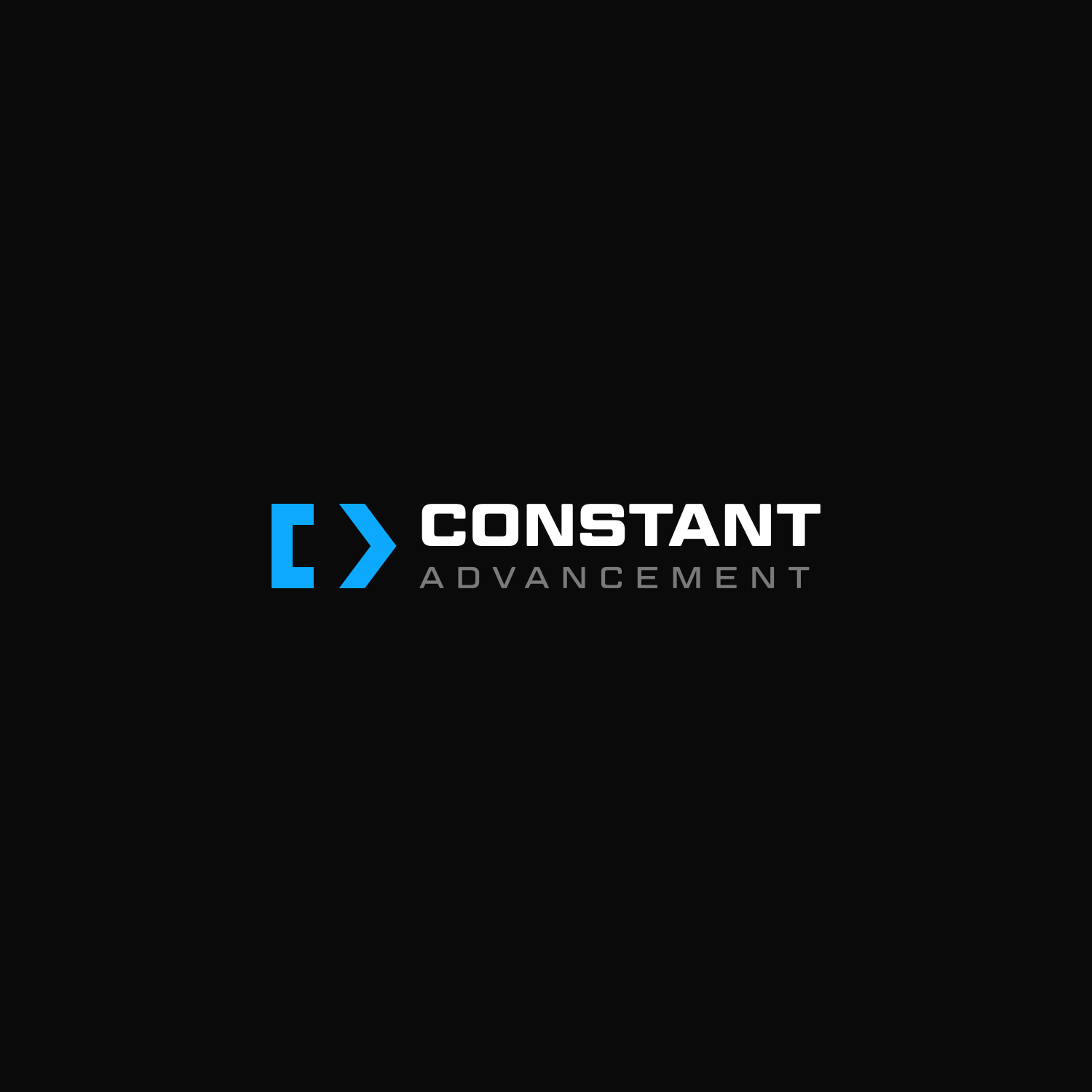
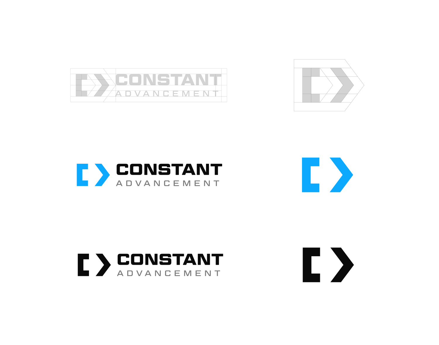
The Constant Advancement logo is crafted from iconic pieces of code, a visual nod to the foundation of what we do every day. It’s a symbol born from the language of technology itself, representing precision, logic, and evolution.
Look closer and you’ll see that together, the brackets subtly form the letters C and A, standing for Constant Advancement — a reflection of how progress and protection are intertwined in everything we build.
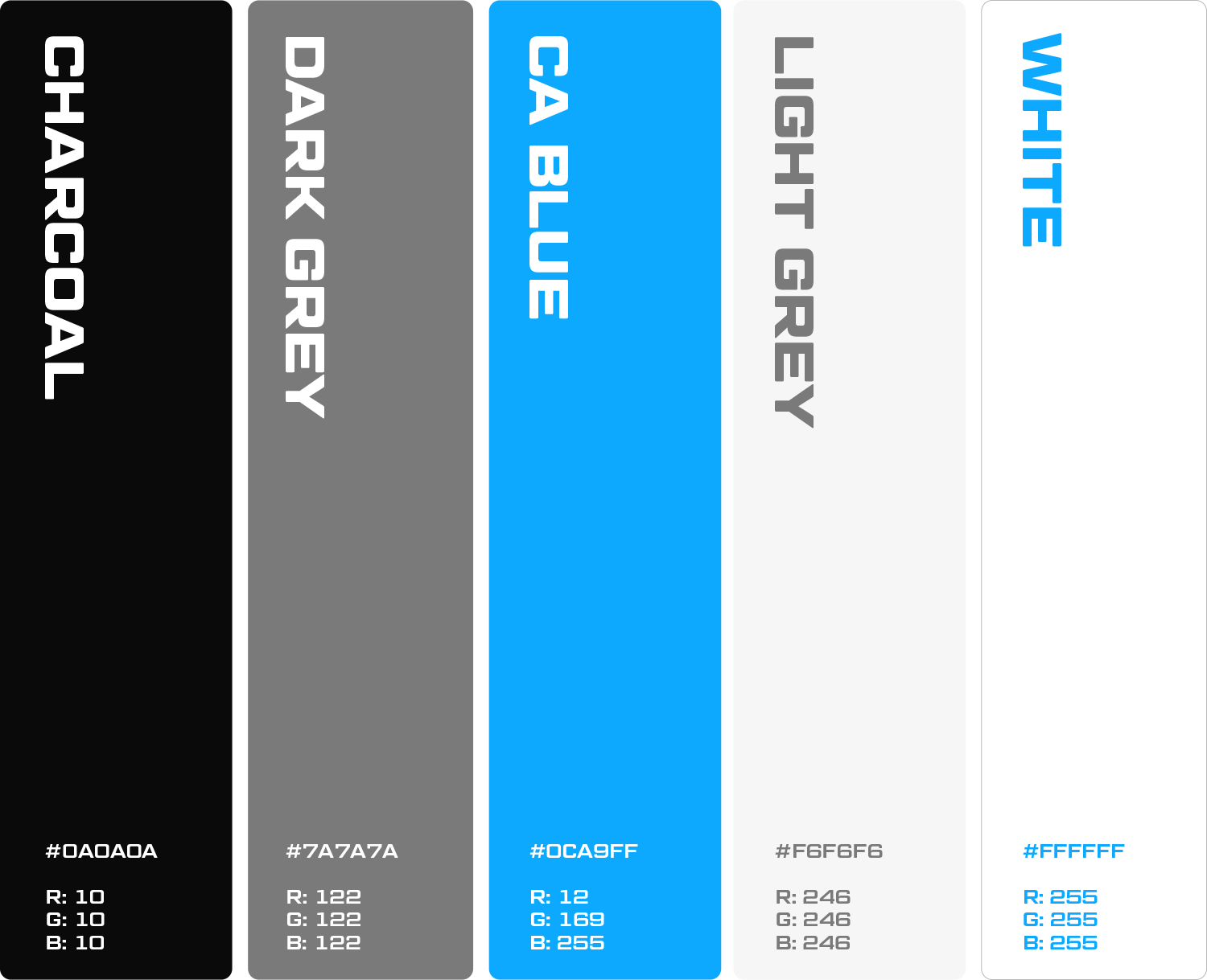
The logo’s symmetry and balance mirror our philosophy: simplicity on the surface, complexity beneath. It’s a mark that represents both discipline and innovation for the future of Constant Advancement.
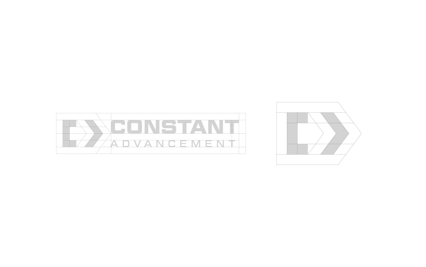
The negative space between the two brackets creates a hidden arrow.
This arrow embodies our mission to push technology beyond its limits while maintaining clarity and control. It’s a reminder that innovation isn’t just about speed — it’s about precision, direction, and the pursuit of progress that never stops.